Air and Back Again

Returning to the 13" MacBook Pro
About a year and a half ago I switched from a MacBook Pro to a MacBook Air. I’ve been really happy with the Air overall—the size and weight are fantastic, it has plenty of power, and it’s pretty easy on the wallet for such an elegant machine. I’d still recommend it for most people interested in a Mac.
Since then, however, the MacBook Pro has become something very different. The DVD drive, Ethernet port, and hard drive are gone, making the whole thing much slimmer, and the display now has four times the pixels—among other things. The iPad has also kept improving, which means I use my Mac on the couch a whole lot less. That makes having the slimmest Mac available less important to me. Of course, I also need to be able to see how my software looks on a Retina display, so I figured it was time to buy a MacBook Pro once again.
The Good
My two biggest complaints with the Air were the storage space and the fan noise. (The Air has actually added an option for more storage since I bought mine, though the new Pro offers even more.) I opted for 512GB, which should be more than enough after living with 256GB for a couple of years. As for the fan: so far I’ve only heard the new MacBook Pro’s fan once, and it was much quieter and more pleasant. (My Air’s fan came on once or twice a day, at least.) The newest MacBook Pros have a unique fan design, with blades that are spaced asymmetrically. The idea is that the fan noise should sound more natural this way, and it works.
I got the 2.9GHz i7 processor and 8GB RAM, which has been more than enough power for me. I’m sure there are ways it could be even faster, but nothing ever feels slow. The processor is an upgrade from the standard 2.5GHz i5. It’s always hard to know if that’s worthwhile, but I’ve been happy with the choice. Battery life is excellent and in line with the Air I switched from.
Then there’s the display. It really is amazing. For years I’ve been wondering when we’d finally start seeing higher resolution displays, when a screen would look more like printed paper. When you’re looking at text in particular it’s just beautiful. It’s not just that the jagged lines and blurry edges are gone, you also get to see all the subtleties of the typeface, the variations in line weight, the quirky curves on certain characters. It’s remarkably pleasant and entirely different. There’s also less glare on the screen, and the image sits closer to the surface of the glass. (Oh and I did miss that glass screen, with its black frame—it may weigh more, but it’s nicer to look at and easier to clean.)
There are also some really great options if you dig into System Preferences. The Display options default to “Best (Retina)”, but you also get a “Larger Text” option, and two “More Space” options. I’m surprised by how great they look and how usable they are. Occasionally I need to get a lot of work done on the road—work that I’m used to using a 27" display for. Those “More Space” options are going to make it a whole lot easier to get that work done efficiently.
The Bad
Of course it’s not all perfect, or Apple wouldn’t still be selling two other 13" computers. It’s an expensive machine—the Air is probably the best value in the current line up. The Air still has the best form factor too—aside from the obvious size and weight, its tapered design makes it really nice to type on. That said, I’m certainly not complaining about the new Pro’s form factor—it’s a vast improvement over the old model.
Then there’s the problem of connecting an external display, which is something I do often. Apple doesn’t sell an external Retina display, so that benefit is lost when I’m working at my desk. There’s no great way to use a laptop for hours a day without an external display, so basically I’m going to spend a lot of time not using the best (and most expensive) feature of this computer. Also, once you’ve spent some time on a display like this, going back is tough—things look jaggier than ever. You’ll also need a clunky (though perfectly serviceable) adapter for the display’s MagSafe connector, since the Pro has the new MagSafe 2 connector.
The Web
Finally, well, a whole lot of the internet looks kind of awful on a Retina display, honestly. Some of it is difficult to fix without updating every site on the web. How do you take an image, scale it up twice the size, and still make it look good? Apple’s current solution is optimized for photographs. But with crisp, graphical elements, or text displayed in an image, it’s pretty terrible. The scaling makes it a bit blurry, but you can still see the pixels, which is a terrible combination. They’d be better off just doubling the pixels, in my opinion. That would make most web pages look just like they would on a non-Retina display—sure, you could see the pixels, but they’d be as sharp and crisp as they were designed to be. (Perhaps using crisp scaling only for PNGs and GIFs would be a good compromise.)
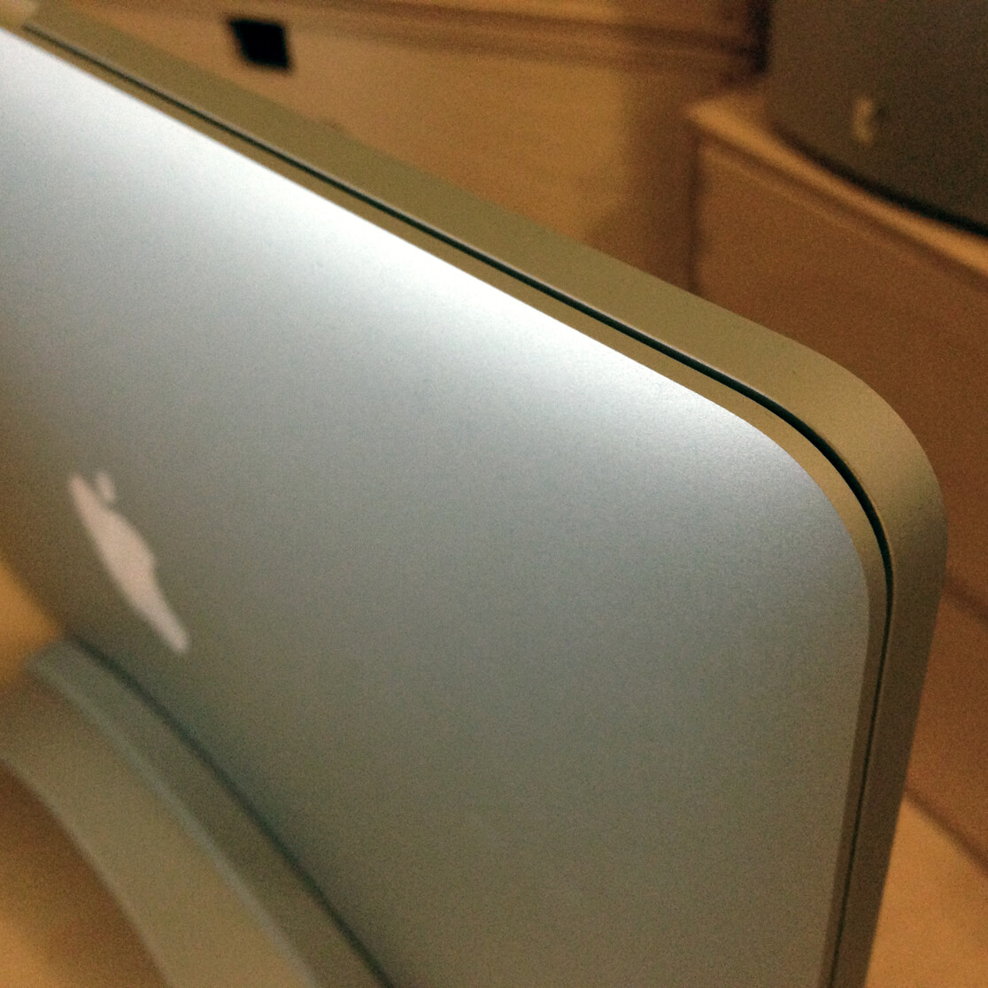
Even worse, there are some visual glitches on certain web pages—white lines down the middle, rounded corners that aren’t drawn smoothly. These problems aren’t on most sites, but they show up too often, and they even appear on an external display running at a standard resolution. The glitches aren’t there on the same display if I’m using my MacBook Air. I assume this will get fixed eventually, but I expected better considering this isn’t the first Mac with a Retina display. (Not to mention it has now been out for three months.) I’ve included a couple of examples of these glitches below.
Update: The OS X 10.8.3 update with Safari 6.0.3 fixes these glitches, thankfully!
Of course there are some exceptions—web sites that do take advantage of the display look exceptional. HD videos on YouTube are stunning.
So is it worth it?
The MacBook Pro with Retina display isn’t as easy to recommend as an iPhone or iPad with a Retina display. You’re paying a significant premium, and the experience just isn’t as polished. One big advantage of iOS devices is the popularity of the App Store—you’ll probably spend more time in apps and less on the web, and most apps are optimized for Retina displays at this point. Plus iOS devices have smaller screens, so things like web pages and HTML emails still look great, even if they’re not designed for Retina displays. On a Mac you’re seeing those things at full size.
The one group of people I’d absolutely recommend it to are designers and developers. High resolution displays are a reality, and they’re only going to get more common. It’s easier to justify the expense if you’re using it for work, and if you’re making apps or web sites it’s a great tool to have. (Especially now that Photoshop and Illustrator support the Retina display.)
If you spend most of your time writing or working with photography you might also find the Retina display worthwhile.
Much like the MacBook Air did a couple of years ago, this computer feels like a big step toward the future. Someday I think Apple will have a single 13" that has it all, but in the meantime, you’re still getting a great computer whether you choose the Air or the Pro. If you’re having a hard time deciding, I’d probably recommend the Air as the best all-around value.
Link to this entry: https://mikepiontek.com/go/8760

