iPhone Duo: doubling my disappointment with Safari
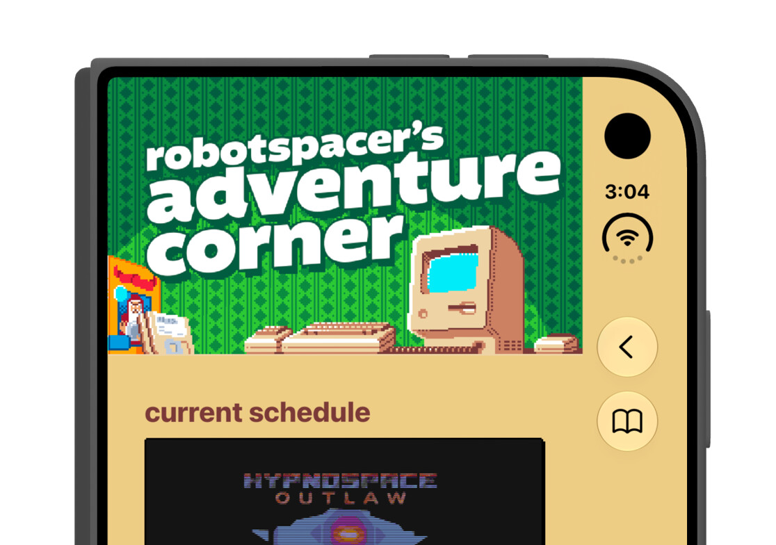
The image above is how one of my web sites looks on Apple’s upcoming iPhone Duo. (Specifically this image is from a simulated iPhone Duo in the Device Hub included with Xcode 27.1 Release Candidate.) A year ago I wrote that Safari 26 and Liquid Glass have little respect for web sites and unfortunately this hasn’t changed.
Last month, Apple announced the iPhone Duo and released a beta version of Xcode that includes an iPhone Duo simulator. I checked some of my web sites to see how they would appear on this device. As you can see above, it’s not ideal. The green bar along the top should extend all the way across. This site uses safe area insets to deal with things like this. For example if you view the site on an iPhone 18 Pro in landscape orientation, the green bar will extend to the edges, underneath the “Dynamic Island” or camera cutout.
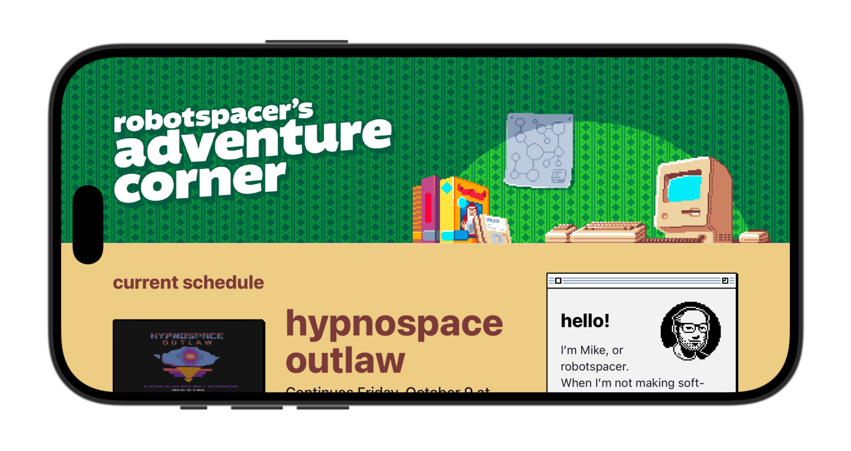
It’s unclear to me why Apple is not opting to treat the iPhone Duo toolbar as a safe area. I have not come across anything discussing their reasons nor educating web developers on the best way to design for this device.
Let’s back up a little bit. As I covered last year, Apple made some changes to Safari across iPhone, iPad, and Mac as part of their Liquid Glass design. Here’s how my site looks a year later, in Safari 27.
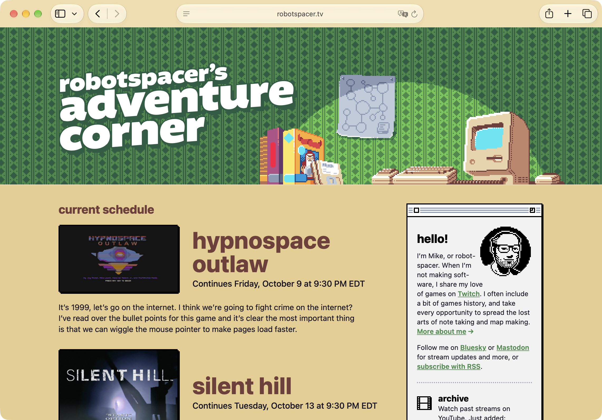
It is effectively unchanged. It doesn’t look terrible, but I’m not happy with the tan toolbar along the top. That’s not how I would have designed this if I had any real control over it. A reasonable person might assume I made this choice, or simply didn’t worry about how the site looks in Safari, but that’s not the case. Apple has decided to examine my web page and pick out a color to use for their toolbar. The process they use to determine this color is complex and not documented. I recently spent some time trying to figure out how it works. Here’s a rough summary of my conclusions:
- Safari is not just using the page’s background color, though often that is what happens in the end.
- As I mentioned last year, it does not seem to use the page’s
theme-colorin any way. - When picking the color, Safari doesn’t seem to consider elements that will move off the screen when the page is scrolled. I believe specifically if the element’s
positionisfixedorstickyit is considered, otherwise it is not. Effectively, if a web developer prefers a toolbar color that’s different from the page’s background color, the site needs to have a fixed bar along the top of the page. - I thought I could just add a one-pixel line across the top of the page with a fixed position. That doesn’t work. It seems to sample 5-10 pixels in from the relevant edge. The magic number seemed inconsistent to me, so I assume it’s looking at the whole edge and taking the most common color, or something along those lines.
- In addition, the color it picks may be adjusted. In some cases it may use the exact color you specified. In other cases it may be brightened or desaturated in ways you don’t have control over. I assume this is done to maintain legibility of toolbar controls, but it doesn’t seem consistent across platforms.
After figuring all of this out, I came up with a modified version of my site design.
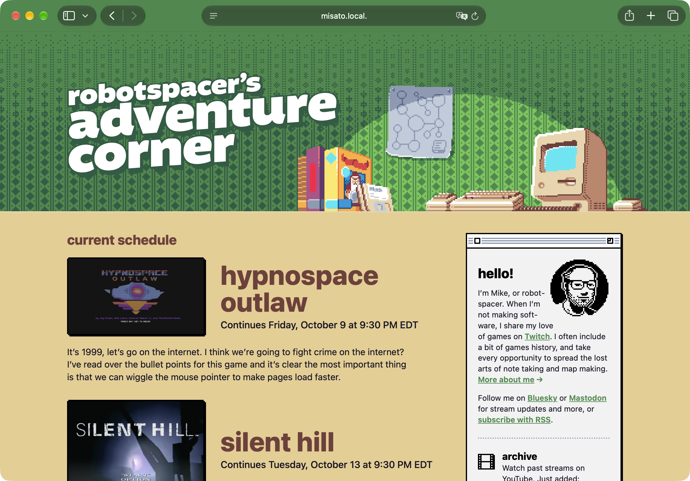
I’m pretty happy with how this looks, though I’m not happy I had to figure out how to do it without any documentation from Apple. This was accomplished by adding a strip of green along the top of the page, fixed to the top edge. It’s about 5 pixels tall. I wrote a simple JavaScript that detects Safari and adds this element, because it doesn’t look great in other browsers. I’m not very happy about that either. I also want to point out that there are still some cases where the page’s background color will peek through, if you scroll or pull the page down in just the right way.
Let’s get back to the iPhone Duo. At this point you might be wondering if Apple is doing some similar undocumented magic with its right-hand toolbar. As far as I can tell, that is exactly the case. But that means my workaround shown in the screenshot above does not solve the problem on iPhone Duo, because they’re doing their color sampling magic along the right edge of the page. If a web developer wants to influence the color of the iPhone Duo’s toolbar, they will need to add a fixed element, around 5-10 pixels wide, along the side of the page.
This also means that if you have a fixed toolbar along the top edge of your site, it will get cut off on the right edge. My adjusted site design looks nearly identical to the screenshot at the top of this post. Here’s how the adjusted design looks if I scroll down the page on iPhone Duo.
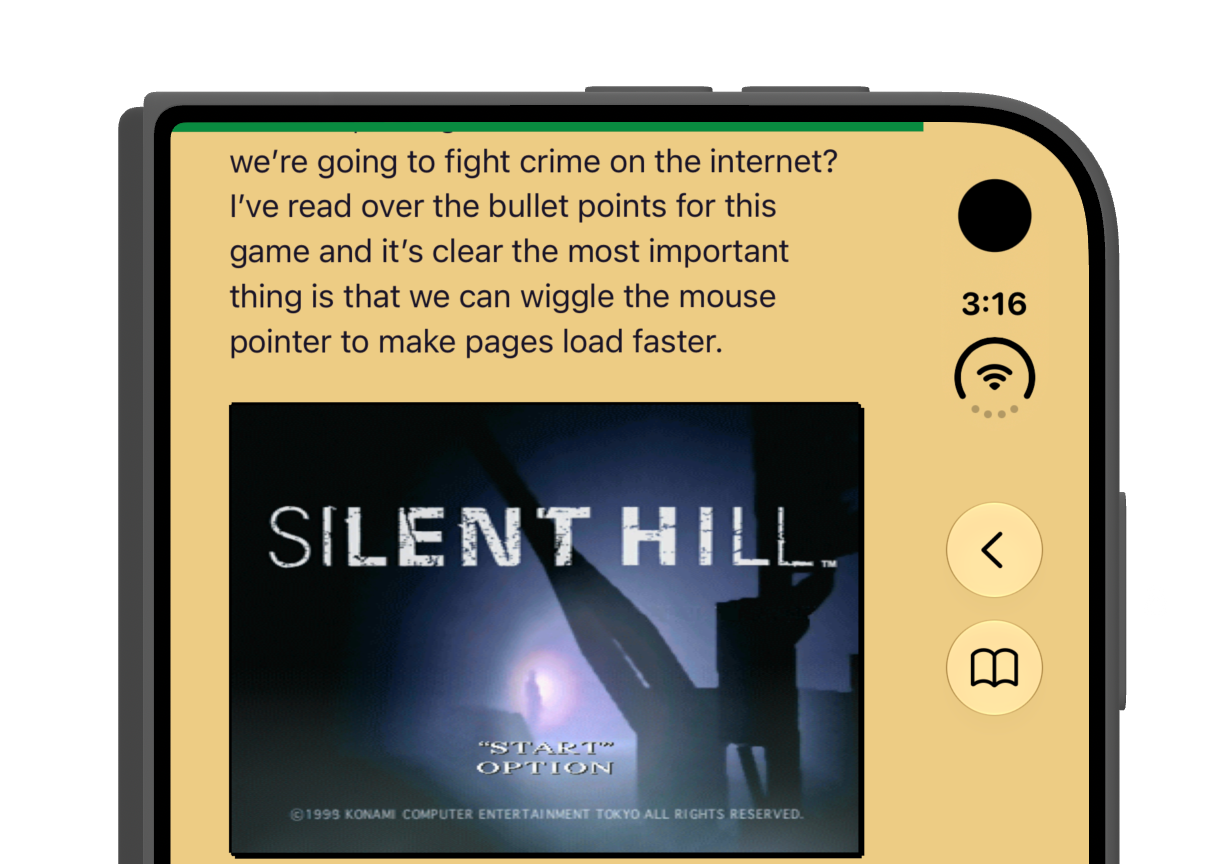
I wouldn’t be too bothered by that green line if it extended all the way across, but it looks terrible as it is. So my workaround for Safari on other devices does nothing on iPhone Duo, aside from making it look a little bit worse.
Here’s how I would like my site to look on iPhone Duo.
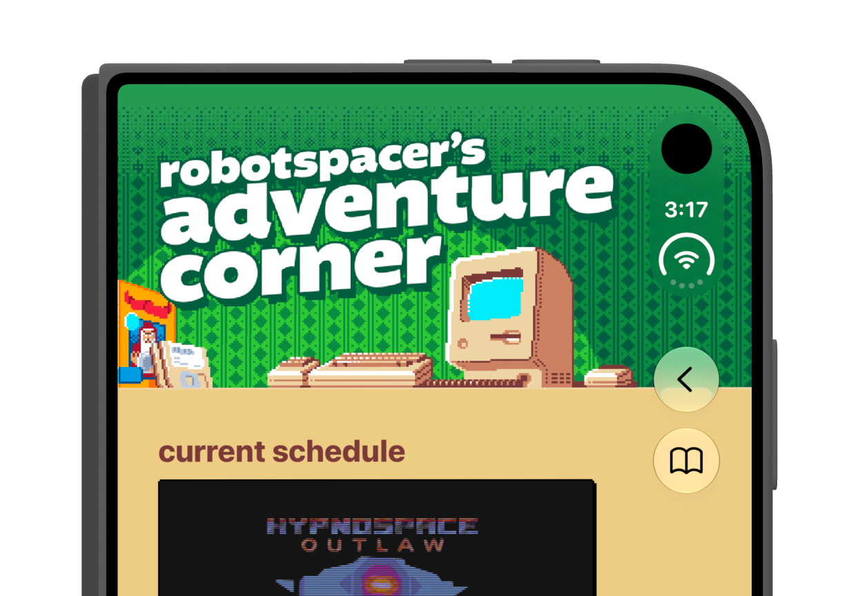
If Apple made use of safe area insets for the right-hand toolbar, this would be simple to do. Web sites that have adapted to other modern devices would get this behavior automatically. As it is, there’s really no way to do this. This is a real screenshot, but it’s a hack. If I make the site extend to the right like this, it introduces unwanted horizontal scrolling that makes the site difficult to use.
My hope is that this behavior isn’t final. I think the iPhone Duo will almost certainly ship like this, but that doesn’t mean it can’t change. That said, I’m not entirely optimistic, considering it’s an extension of the existing behavior that has gone unchanged and undocumented for well over a year now.
In case it’s not obvious, I complain about this stuff because I care a lot about the web and Safari is my preferred web browser. The Safari team did such a great job of giving web developers the tools they need to make their sites look great in the past, and I hope they’ll return to that at some point.
Link to this entry: https://mikepiontek.com/go/10104